Google has recently made Android O official and today we are here to showcase some of its features and overview of this android version. Although, this build will not be made available through the Android Beta Program, however, it’s meant only for developers to be able to get an idea of what’s new. So lets put a sneak peak into it.
1) New Settings app

(source)
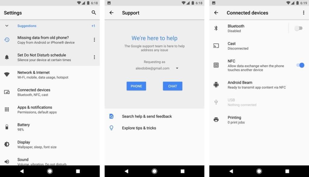
It comes with a fresh white coat of paint, slide-out navigation area which was there in the Nougat is now completely gone. Settings toggles like NFC, Cast and Android Beam are more discoverable, living in the new “Connected Devices” area.

(source)
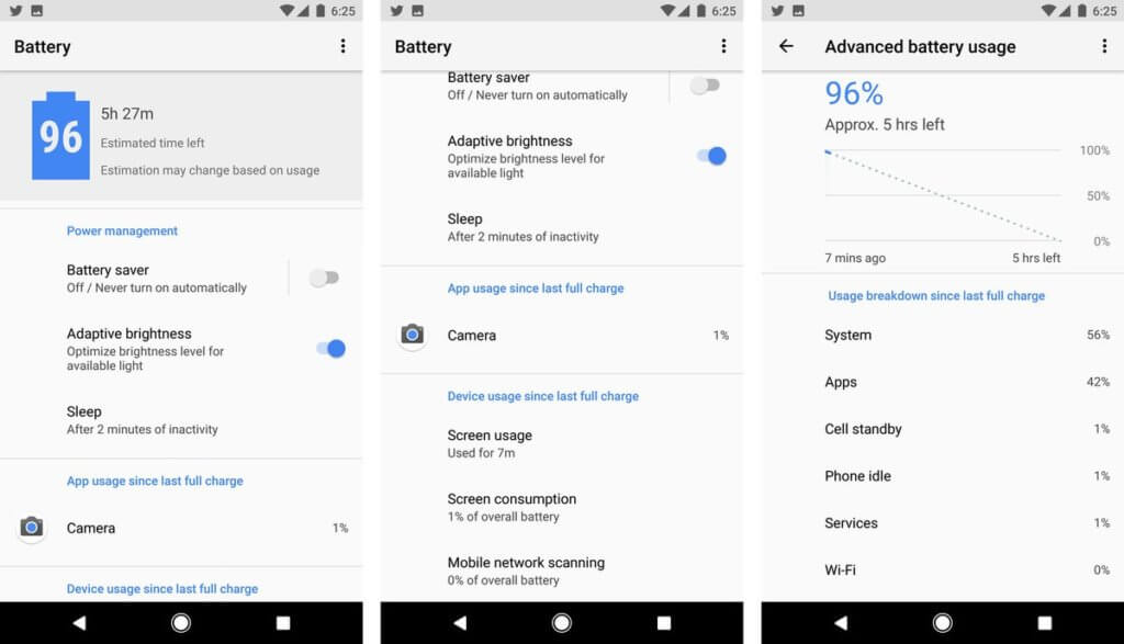
Battery Settings is redesigned in a new level,with a top-level estimate of your remaining time left, and screen-on time surfaced right on this page, below app power usage. the line graph only showing your past and estimated future battery consumption.
2) Android’s Ambient Display

Android’s Ambient Display feature has got a big change in Android O. By default, only app icons are shown alongside the system time. When a new notification arrives, it pulses the lock screen in an enlarged form — which doesn’t mirror Android’s lock screen layout directly. You’ll only see detailed notification info when it first pulses the screen. you’ll need to double-tap the screen or use the fingerprint scanner to get to past the Ambient Display.
3) Notification Settings

(Source)
When you swipe down the notifications shade you’ll see the first visual changes in Android O. The strip of six toggles at the top of the notifications shade now takes up a little more space on-screen and there’s a little re-ordering of the toggles in Android O.If you have multiple notifications, you’ll notice that as you drag the notifications shade down, a tiny icon for each notification appears in a horizontal line at the bottom of the shade. As you drag the shade down, each icon pops up and expands into a full notification as more screen space becomes available.
A snoozing function is in too, which gets rid of a notification for a period of time, and then shows it again.the current options are 15, 30 and 60 minutes — which is a convenient option for dismissing alerts for the moment without the risk of forgetting about them later.
4) SystemUI Tuner
you can enable the System UI Tuner to tweak certain things in Android O according to your personal preferences.there’s no longer an option to add a tiny percentage readout to your battery icon. You’ll see it spin and feel a vibration when the option has been added to the Settings menu.
5) External sources

The external Sources has now an app level permission, what we used to do in earlier Android versions are you’d allow third-party APK files to be installed via one master switch under security settings.In Android O, that’s handled as an app-specific permission, and you’ll see a prompt telling you an app doesn’t have this permission the first time you try to install an APK via, for example, Gmail or the built-in Files app.
6) Lock screen
The lock screen in Android O looks the same as in Nougat but you have options buried in the System UI Tuner for mixing things up.Since we’re talking about the lock screen, Ambient Display has also been revised. While this is more than likely just a developer preview issue, most of the time Ambient Display will only display the clock and some tiny app icons for any notifications awaiting you.
7)Picture-in-picture support
app developers will be able to have their video apps continue playing in a small floating window while you navigate to other areas of the app or to completely different apps entirely. Android O will have support for custom controls like pause and play and developers will be able to set preferred aspect ratios.
8) Audio
Sony donated their LDAC codec to Google for inclusion in Android O. That means if you have LDAC-equipped Bluetooth headphones you’ll get much better quality.Android O also has support for aptX and aptX HD as well as SBC and AAC. There are also settings for audio sample rates and bits per sample too, plus Android O adds a native AAudio API for apps that require high fidelity, low latency audio.
9) Adaptive icons
![]()
Adaptive icons are a fancy way of saying that Google is making an attempt to tidy up the hot mess of inconsistent app icons in Android.So if the default app icon shape for your phone is a rounded square then that’s what you’ll see across the board.
10) Wider color gamut for apps
Android O adds support for “wide-gamut color for apps” which sounds a lot like native HDR support but which is actually just a larger palette of supported colors for app developers.
Android developers can now take advantage of devices that have a wide-gamut color capable display.
Android O also gets font resources in XML, support for adaptive app icons, wide-gamut color for apps (think AdobeRGB, Pro Photo RGB, DCI-P3), LDAC, Wi-Fi Aware (for nearby devices to communicate via Wi-Fi without an internet access point), as well as the Telecom framework – which lets third party calling apps integrate with the system.
For more update and review coverage , keep following TechArx. Do let us know what you feel about with this New Android O. Till then I, Sounak Chakraborty Signing off.


