Leak
Did we just get a glimpse at the new windows? You bet we did. June 24 was our red-letter day, but as tradition goes, there came a leak.
A Chinese social media platform BAIDU (百度) user takes the credit for the leak. The first thing we should be aware of is that this is more of a makeover of Windows 10 as, under the interface, it runs the same OS. Microsoft wanted some hype for business, but the first thing after booting up, you are going to feel right at home, there is no new interface to take you back.
Indeed, all the different Windows 11 versions come in the good old Home, Pro, Enterprise, and more such variants. Once you actually start the fresh install, that’s where the Out Of Box Experience makes your jaw drop.
You may think that this looks a lot like Windows 10X. Well, you are not mistaken. Windows 10X promised a lot of under-the-hood changes, such as running apps in containers so they couldn’t access the rest of the file system. Well, you have to look forward to future releases for that as, as of now Microsoft is just bringing over the Windows 10X shell on top of Windows 10, and calling it Windows 11.
Another which may have caught your attention may be the revamped, more refined, more posh blue Microsoft logo where they have let go of the old boring trapezoidal logo that we had before and flattened it out into a square. This is likely a big part of the Redmond firm’s move to make things more Microsoft-branded instead of Windows-branded.
Another much-needed makeover of the Sun Valley design is rounded corners. Gone are the sharp corner boxy designs of Windows 8, it’s finally scaling that back for those sleek elegant rounded bezel displays of swanky new machines.
The age-old start menu has been moved from the edge to the center.
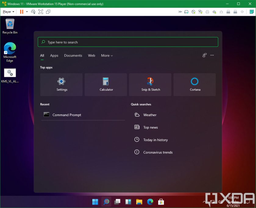
Windows Search feels fresh out of the box, with pop-ups in the center of the screen with requisite filters.

The leaked look at File Explorers shows us a plethora of visually appealing icons but Devs on a Windows Insider are already acquainted with those icons
From what we know, apps like Microsoft Edge are still the same as there is no change in in-app usage.
From what we know to date, there has been no paradigm shift in the settings module, they are identical to previous versions, though we may see changes in the final release.
There are lots of customization options for the taskbar, including an option to align the taskbar, and as we delve deeper, we’re sure to find more.
Virtual desktops are in the same place, but there’s a new stock wallpaper. The one you’re seeing is for the light theme, but there’s another one that has a dark background. There are several wallpapers like this, and one thing you won’t find is something with a Windows logo with light shining through it as we saw with the Windows 10 hero image.
A newcomer feature to windows is widgets. It’s identical to its macOS counterpart, and it’s presumably taking the place of Live Tiles. The widgets appear differently in light and dark modes.
Well, waiting with bated breath for the upcoming release event, its disappointing for some as it has doused the flames of expectations of some as well as maybe added a lot of appeal for the Gen-Z. Tell us in the comment section what features you liked, hated or want in the upcoming releases.
Picture Courtesy : Our Fellow Journalists over at XDA


